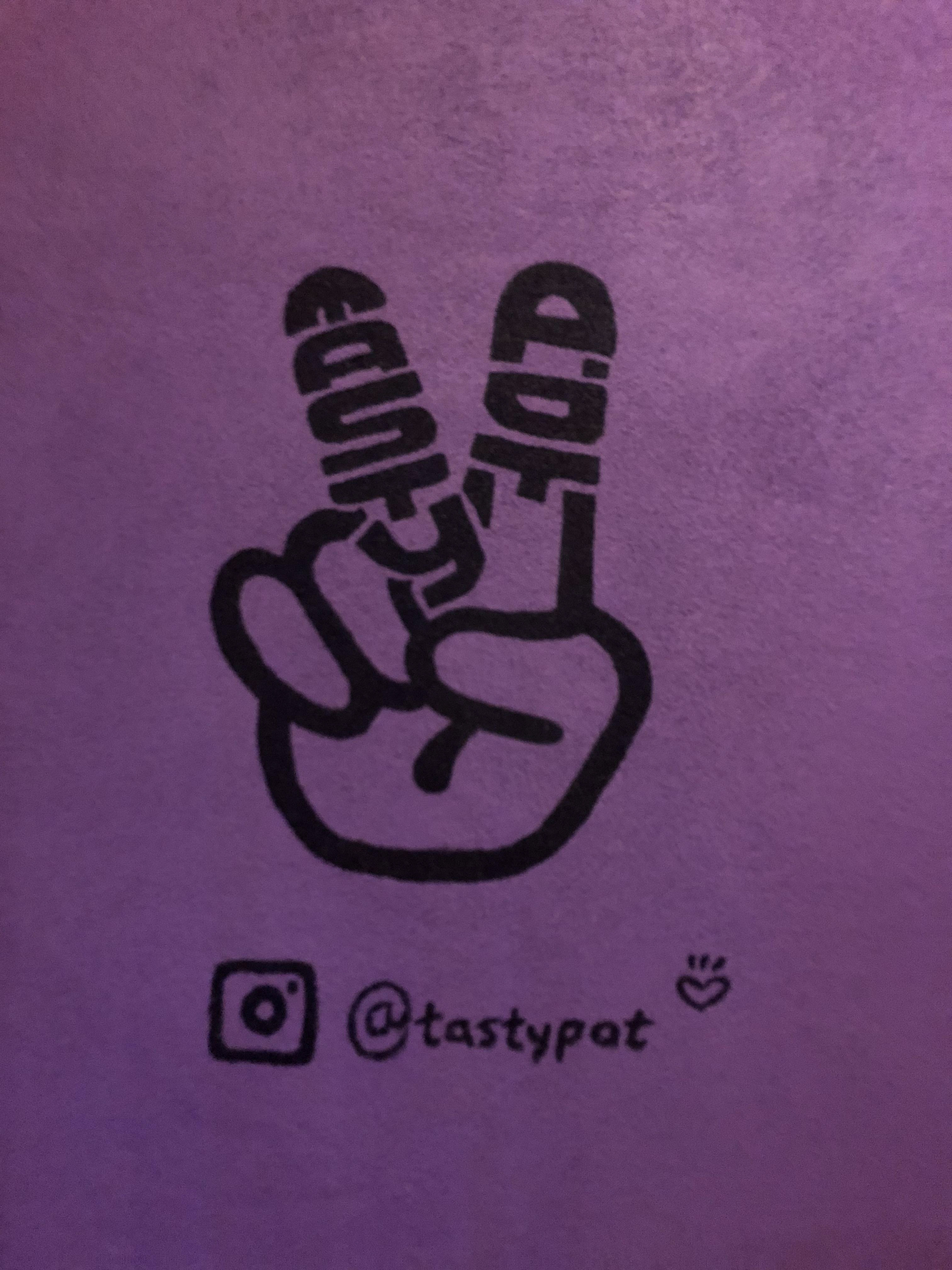
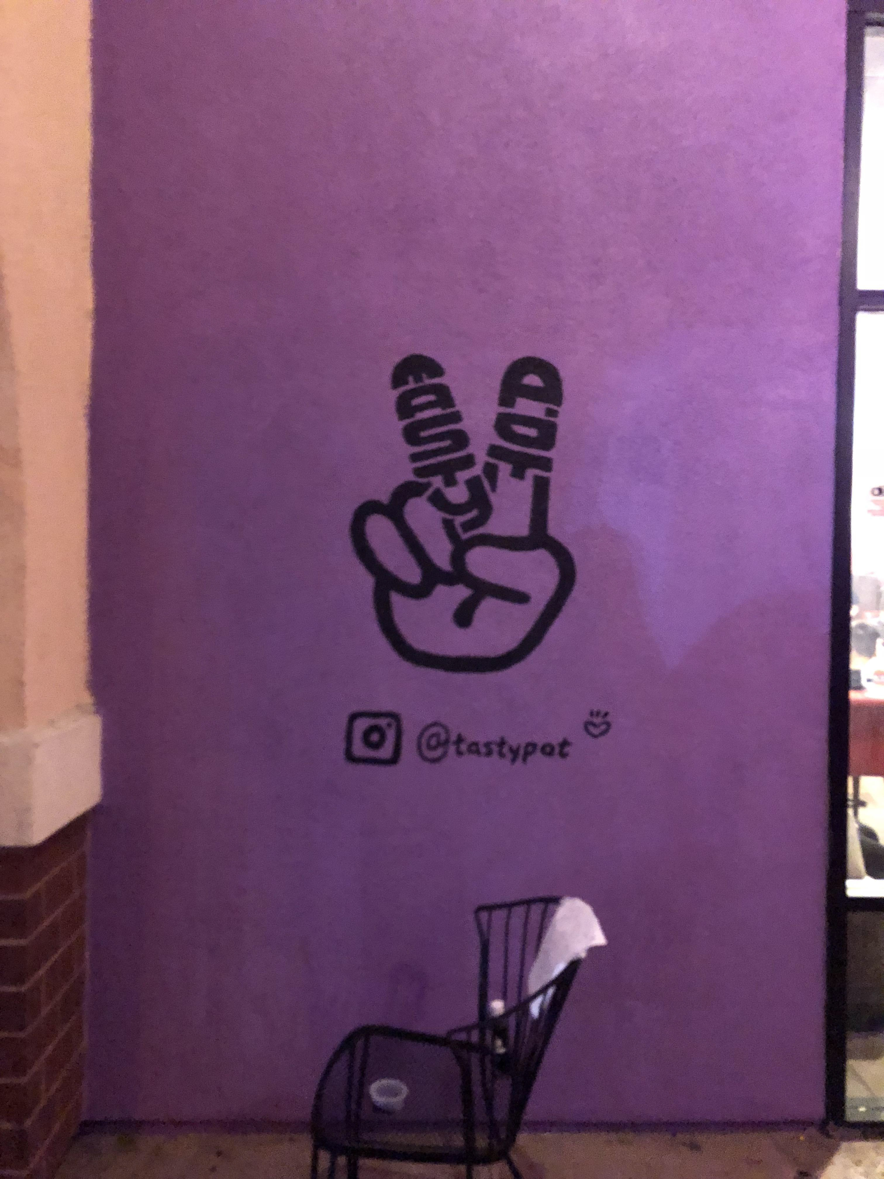
⇧ This is the final product of the outdoor logo design. A victory gesture with branding inside.
1
2
3
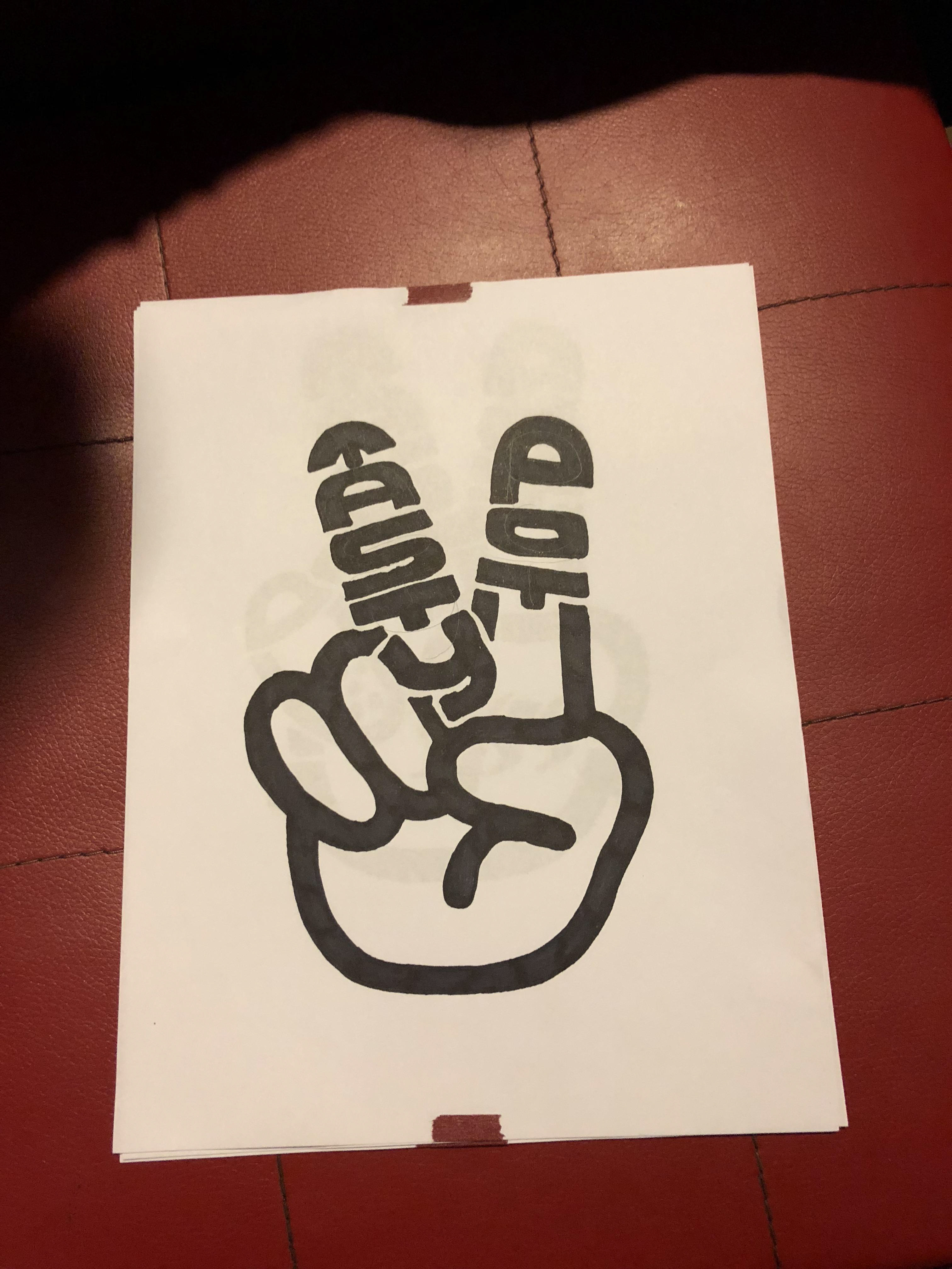
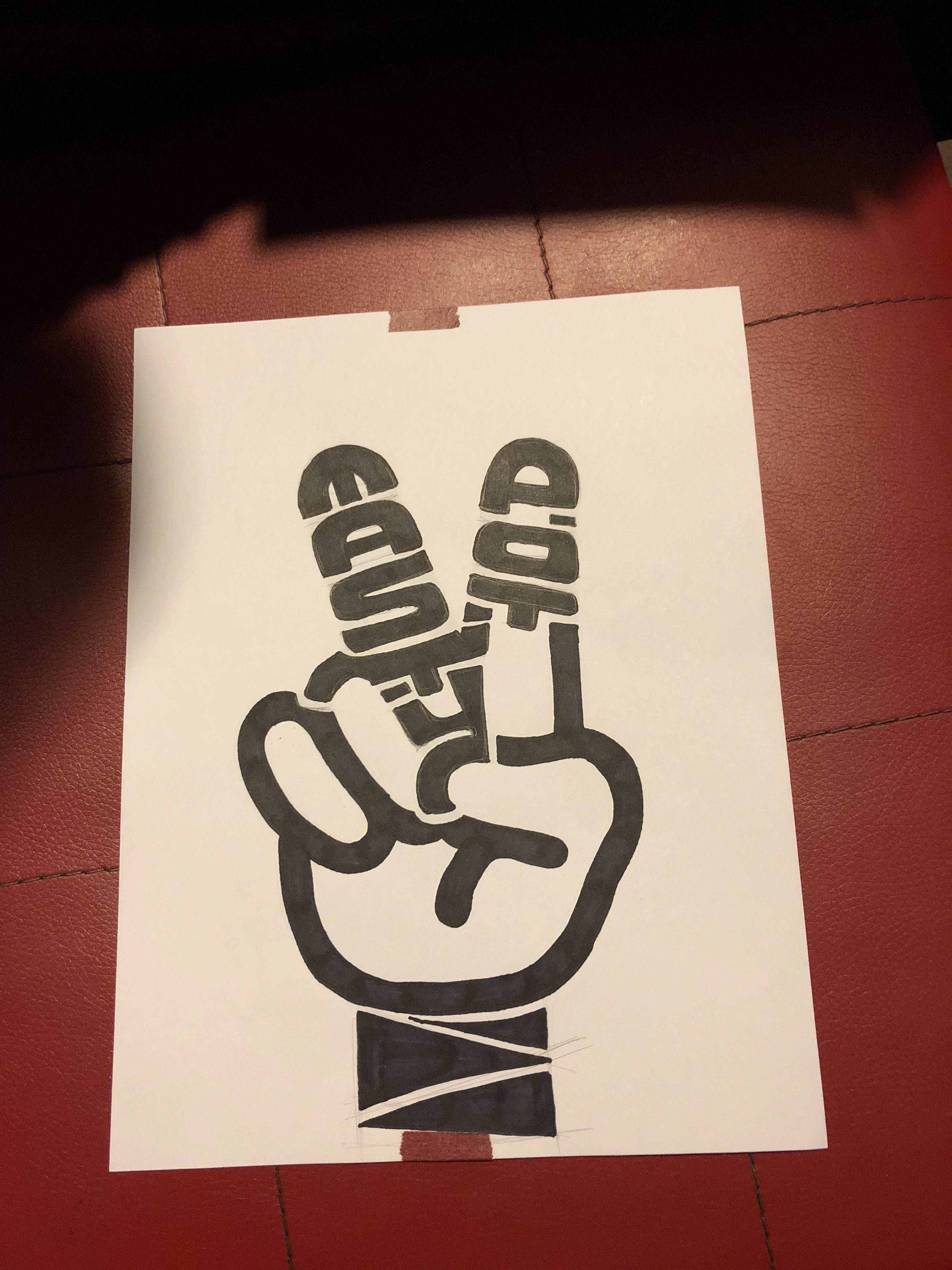
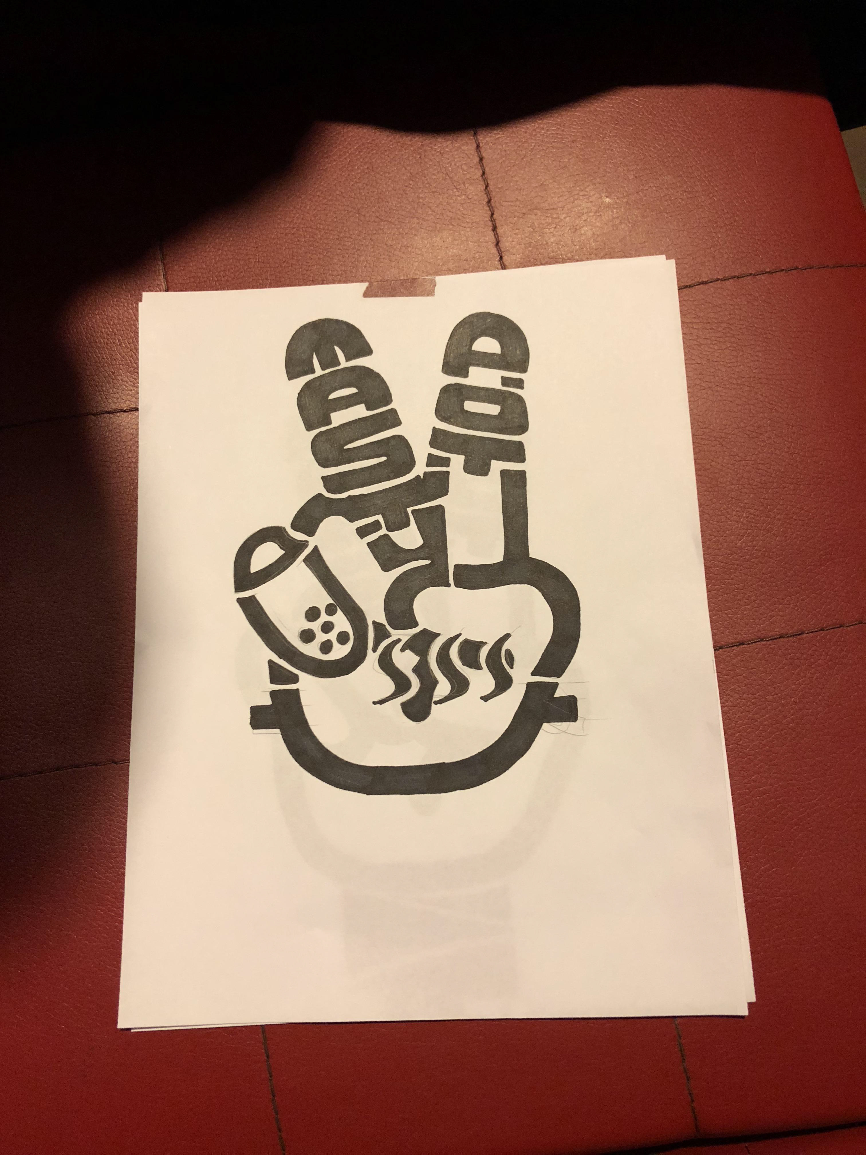
⇧ Before I started to work on the wall, I got to outline the design first. These were the three designs I made at the beginning. It was a victory gesture, where I wanted to give our customers a image that having hot pot is a victory. In the gesture, I inserted the brand name Tasty Pot into the fingers to make it stand out.
For the first one, it was simply victory gesture with brand name in there. For the second one, I added the arm to the gesture. For the third one, I added the boba tea and hot pot into the gesture to emphasize the specialty of this restaurant.
In the end, the owner chose the first one to put on the wall since he didn't want to make it too complex. Next, it is time to "print" it to the wall.
Before work.
Starting to sketch on wall.

Final product 1.
Final product 2.
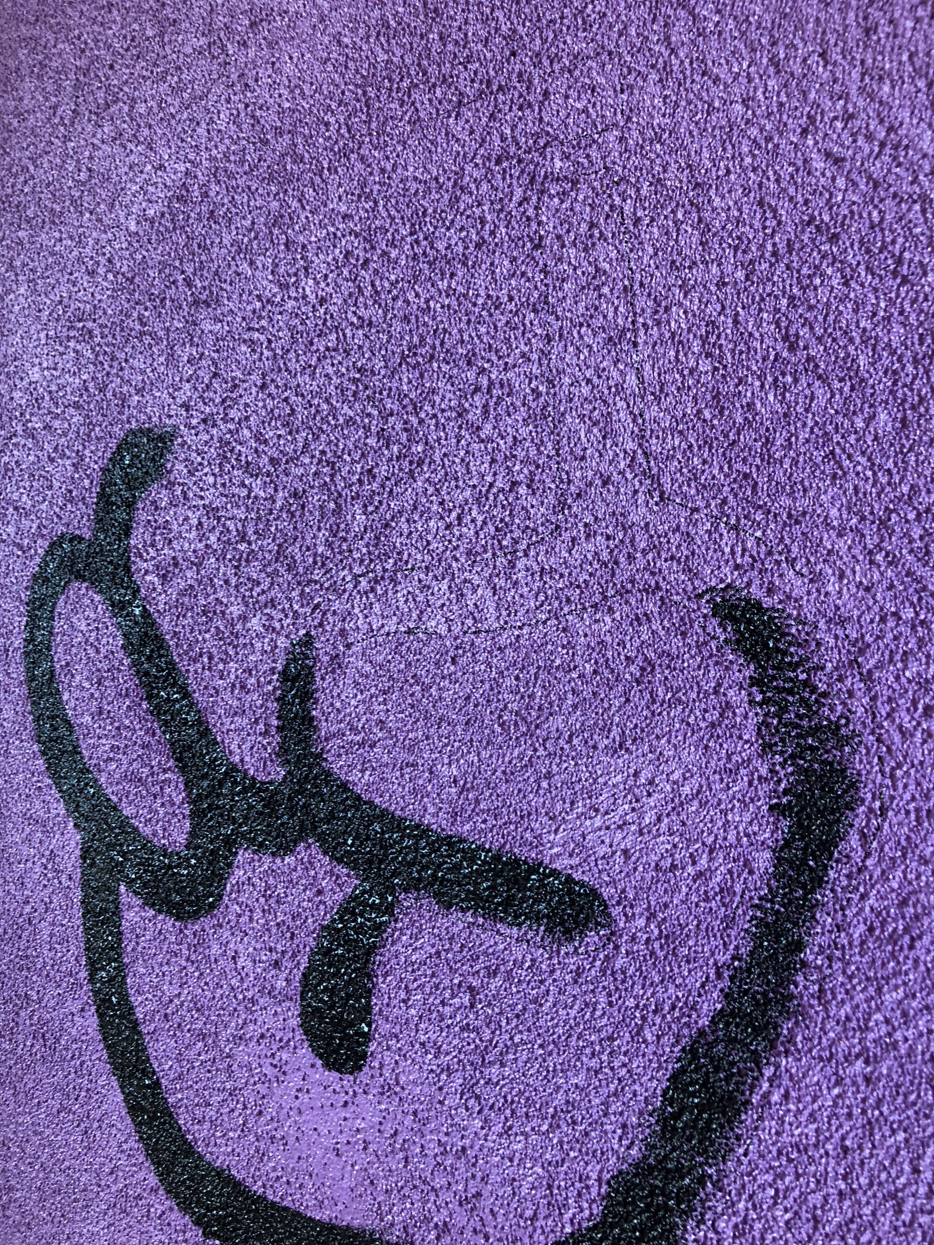
⇧ The paint I chose was acrylic. The reason I chose acrylic was because it was going to be outdoor, where there might be sunshine, rains, and winds, and it had to stand in those. Acrylic paint made it a perfect fit where it was water-proof paint.
I sketched the graphic on the wall for half day, and it was done. It actually looked great in person (I didn't take a good photo).
* [Fun Fact: I even chose the color of this wall earlier. The purple paint was bought from Home Depot, where I spent a lot of time standing there choosing the color.]